When three golfers decided to take a swing at another hobby—brewing beer—what started as a side project quickly grew into a serious small business. As a result, Backswing Brewing needed branding and a design system to set them up for growth. That’s where we came in.
Work Included
Brand Strategy
Logo Design
Packaging Design
Ad Campaign
Brand Guidelines
As the market for craft beer continued to expand with the addition of new breweries, it was important to develop a strategy unique to Backswing Brewing that would help stand out from the crowd. We looked to the game that inspired the name. Any golfer knows that consistency goes a long way towards a better round of golf. So our approach was simple: Be consistent and don’t take the brand too seriously—for a better round of beer.
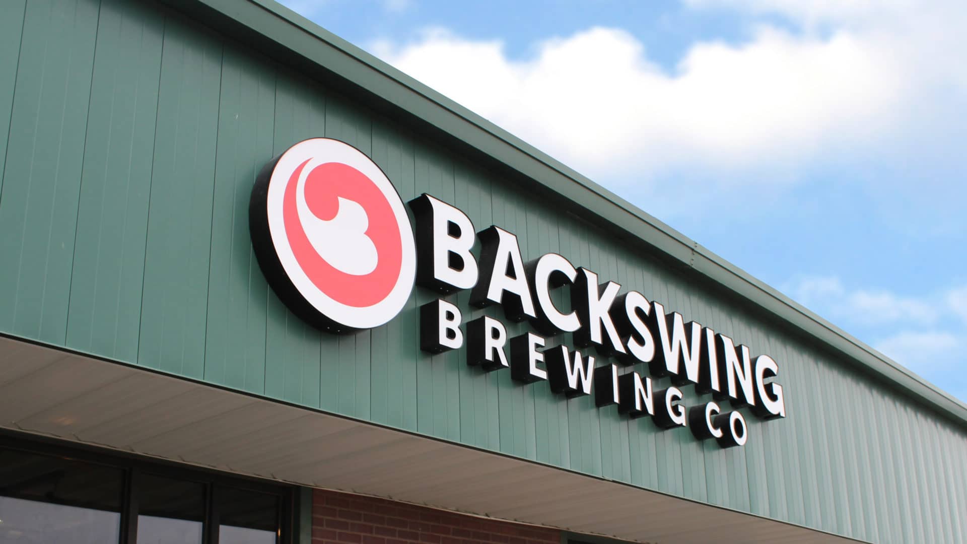
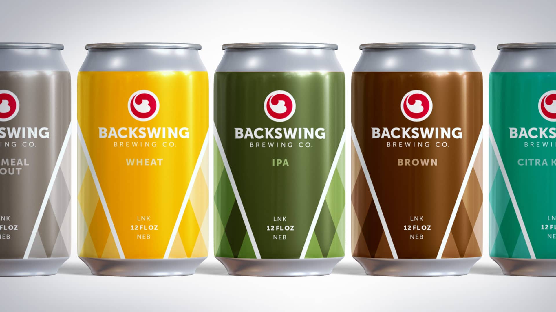
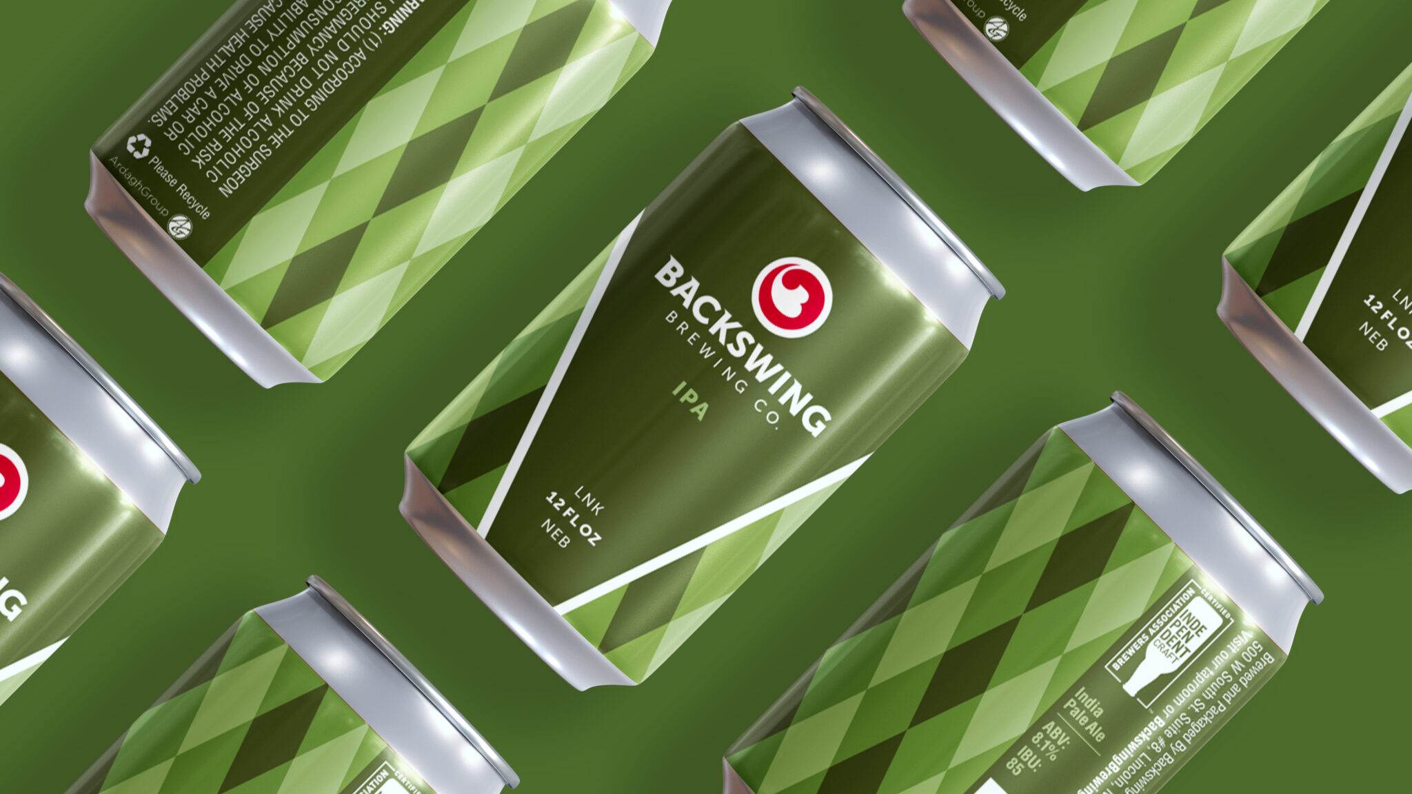
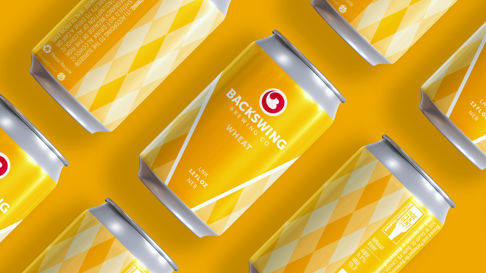
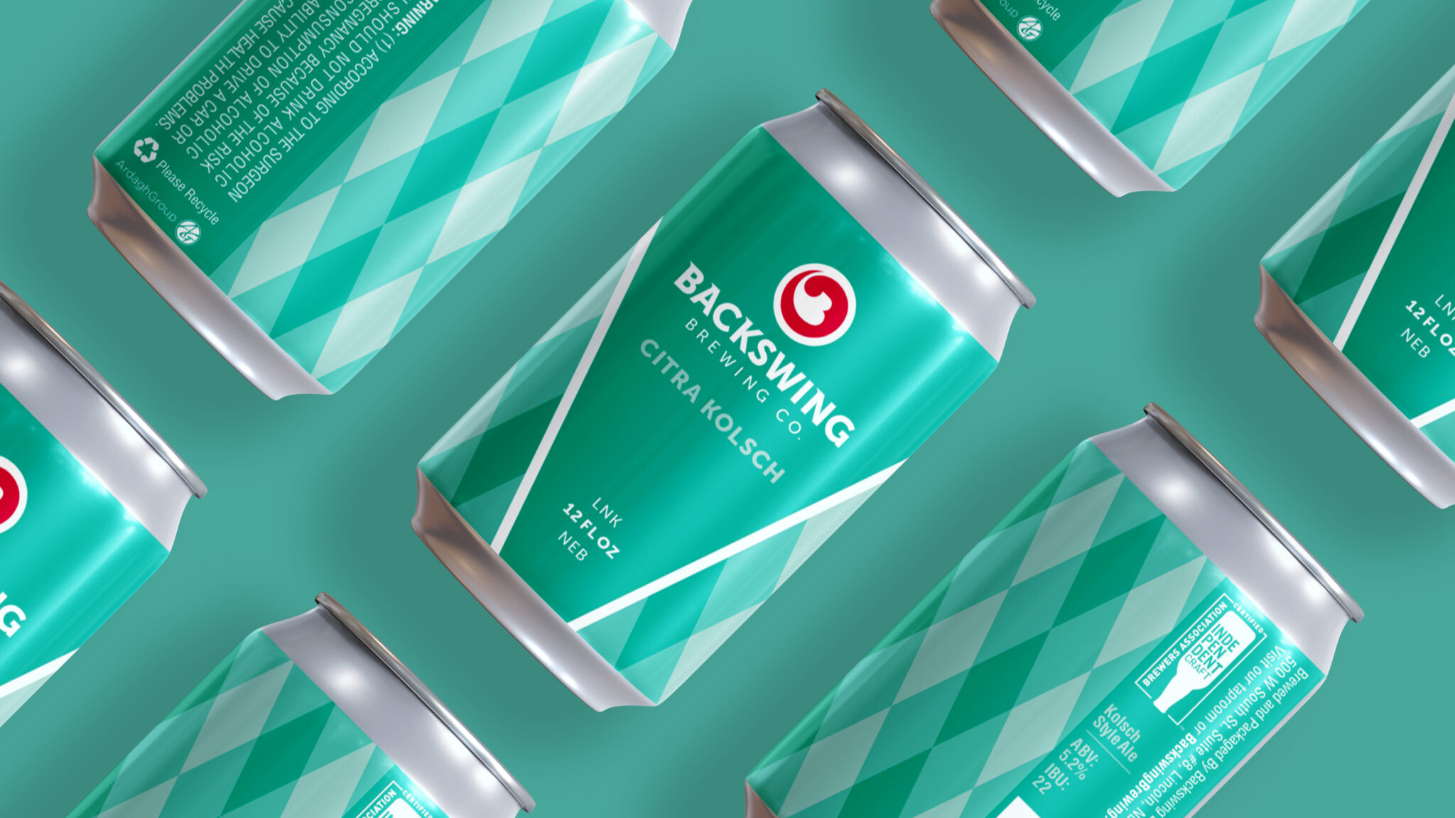
The logo design is simple to identify and easy to remember. The shape is inspired by the motion of golf backswing, while the bright red color draws attention to the logo. Customized typography also includes a sense of motion.
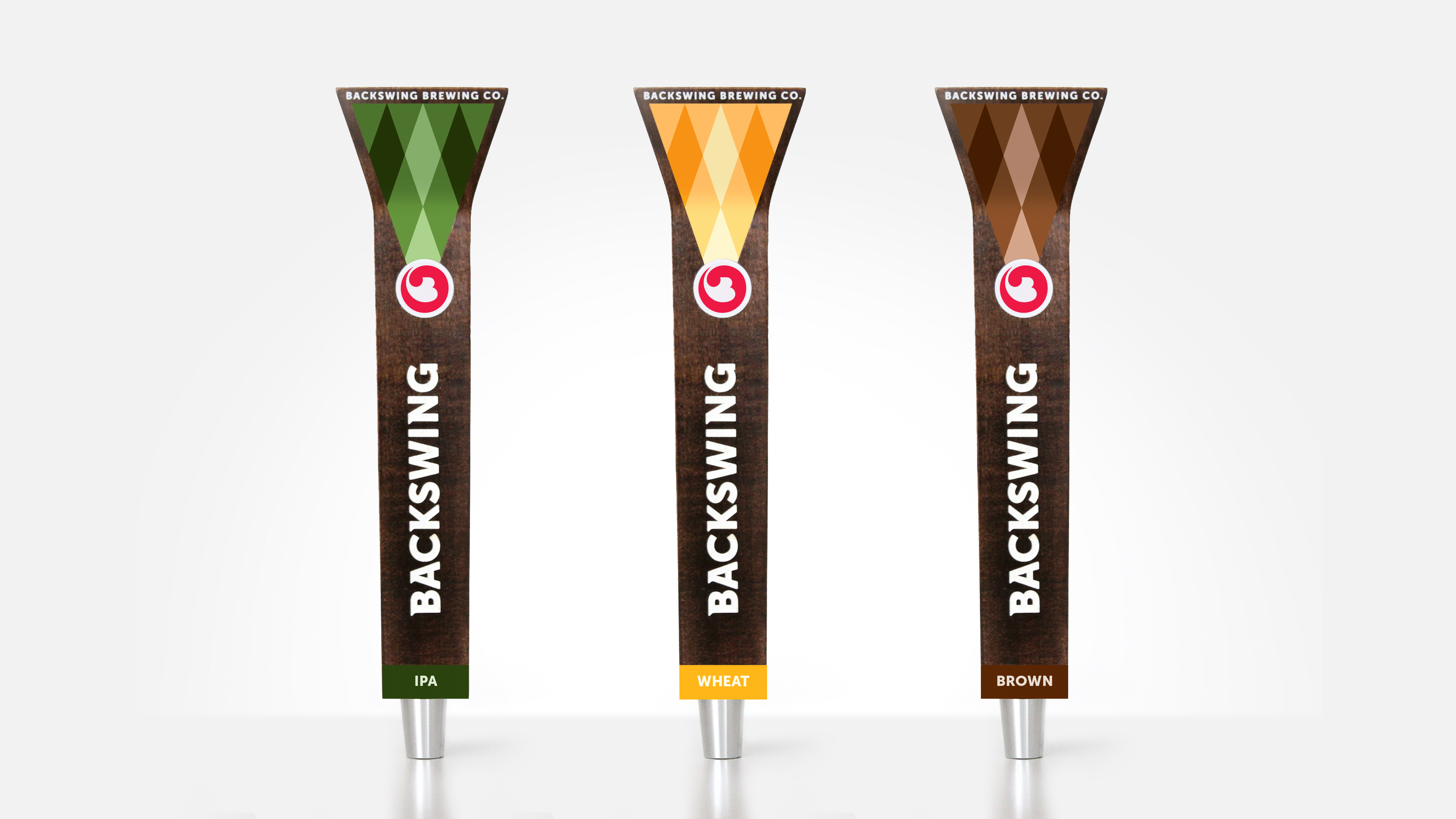
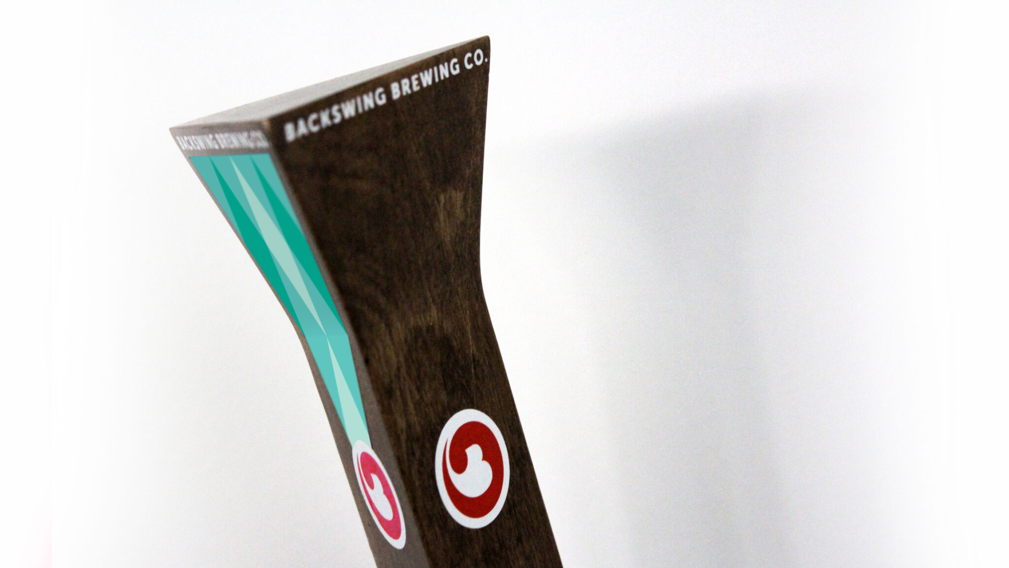
Golf tees inspired the shape of the brand tap handle designs. Each tap is crafted out of wood with the Backswing brand name and icon painted on. In order to make the branding as visible as possible in the environment—from either end of the bar, the tap handles were made to be three-dimensional.
While the form of the tap handles was important, the function was equally important. Tap handles may be used for different brews throughout the year, so the handles were designed to be flexible. Colored stickers are placed on the top and bottom of the tap handles to identify each unique brew. When the flavor of beer is switched, the stickers can then also be peeled off and replaced—an easy and cost-efficient solution for the brewery and those working at the bars.
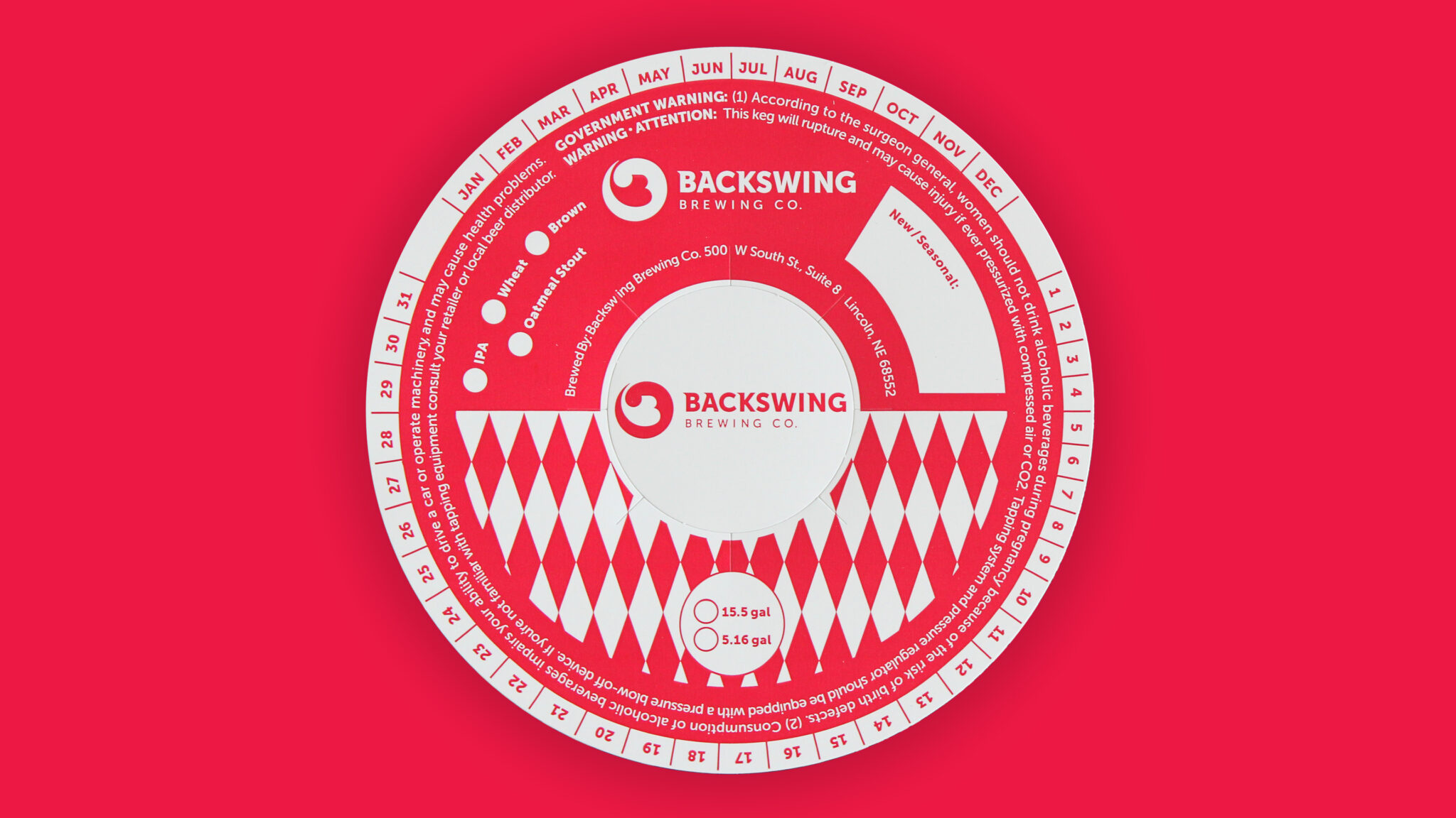
Every opportunity to make the branding more impactful was considered. Keg rings, placed on top of barrels to identify the brew type, were designed with Backswing’s bright red color and using the brand’s argyle pattern.
Can labels incorporate the same colorful palette and argyle-inspired pattern as the tap handles. Each label has a similar layout, creating a unifying look across multiple brews on store shelves.